Brand guide
The AgenticOpenFinance™ visual identity
Logo, colours, typography and usage rules, for teams, partners and media. These decisions are provisional and may change before launch.
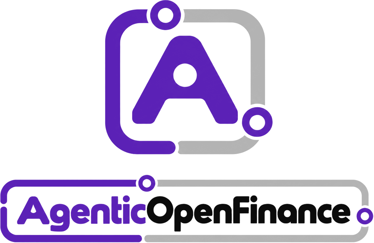
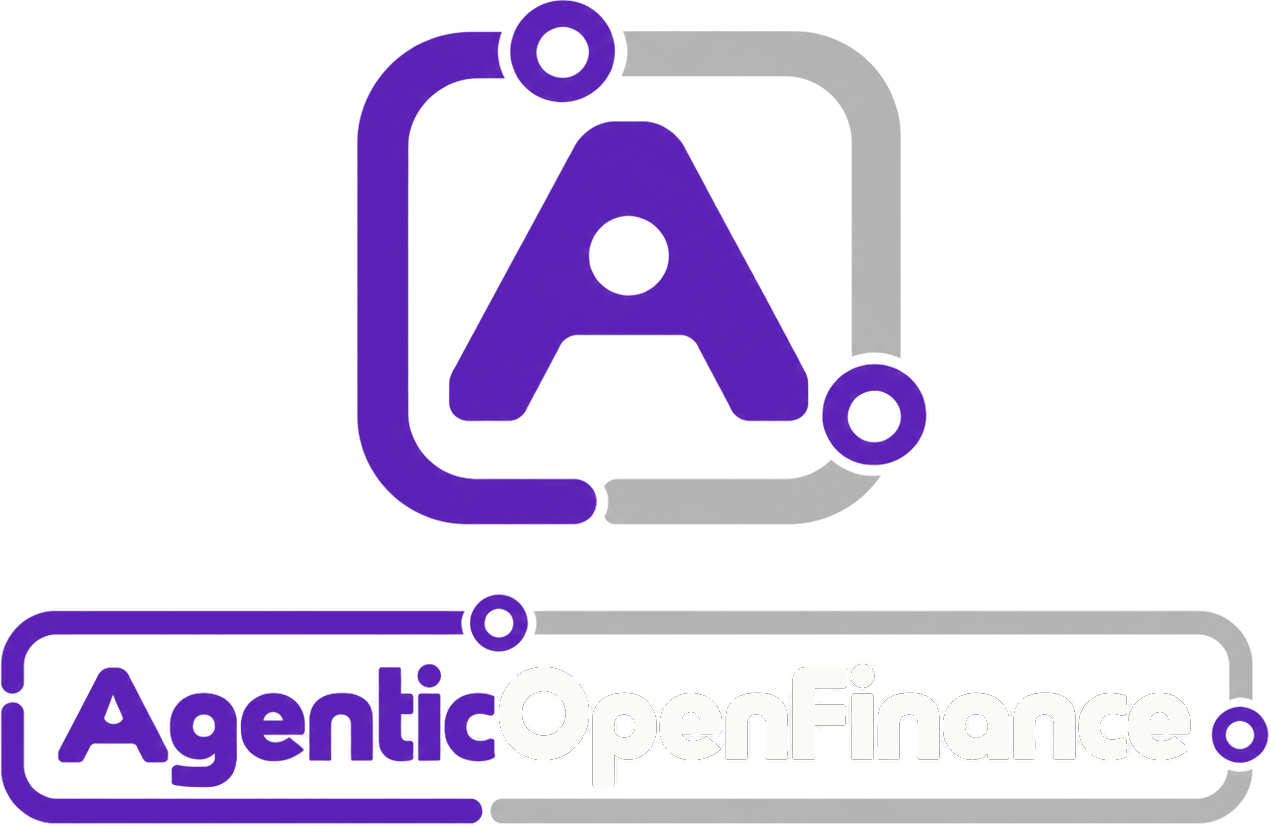


The logo has two parts: the geometric A inside a rail frame, and the wordmark "AgenticOpenFinance™", written as one word, in its own rail. "Agentic" and the rail's leading half are dark arghavani; "OpenFinance" is black. The rail is not decoration: it stands for the governed path every agent action takes.
Click a colour to copy its code. White text on dark arghavani reads at 10:1. Status colours carry meaning only: success #127436, warning #A24A08, error #B91C1C.
No agent moves money without a mandate.
Identity, mandate, policy, approval, evidence.
Every agent action is checked against what the principal allowed, and every result is sealed.
Agent-native infrastructure for open finance.
POST /v1/payments { "mandate_id": "mdt_4Q7K2P" }
Space Grotesk for headings, text and numbers, Geist Mono for code; both under the SIL Open Font License and self-hosted. No script or decorative faces, no gradients inside letters.




 2X2X2X2X
The base unit X is the diameter of one rail node. Keep at least 2X clear on all four sides: no text, image, border or interface element inside that area.
- 180 pxMinimum width of the standard logo (digital)
- 120 pxMinimum width of the compact wordmark
- 24 pxMinimum icon size
- 35 mmMinimum width of the standard logo in print
- Write the name as one word: AgenticOpenFinance™.
- Keep the rail frame as part of the logo.
- Keep the logo flat, with no effects.
- Respect the clear space and minimum sizes.
- Use the dark version on dark backgrounds.
- Break the rail at random or asymmetrically.
- Add nodes to the frame.
- Put gradients, shadows or glow on the logo.
- Use robot, sparkle or brain imagery next to it.
- Imply that a bank, network or AI vendor endorses the brand.
Notifications look the same in every product: a round node in the status colour, a short title, a one-sentence message, at most two actions and a time rail at the bottom. The surface is dark and flat: no glass, no coloured shadow, no gradient. Hover to pause the timer; on a phone, swipe it away.
AgenticOpenFinanceNotify.show({
  type: "warning",
  title: "Mandate expires in 7 days",
  message: "The household bills agent stops paying on 2027-03-31.",
  actions: [{ label: "Renew", onClick: renewMandate }]
});